Productivity analytics
- Tier: Premium, Ultimate
- Offering: GitLab.com, GitLab Self-Managed, GitLab Dedicated
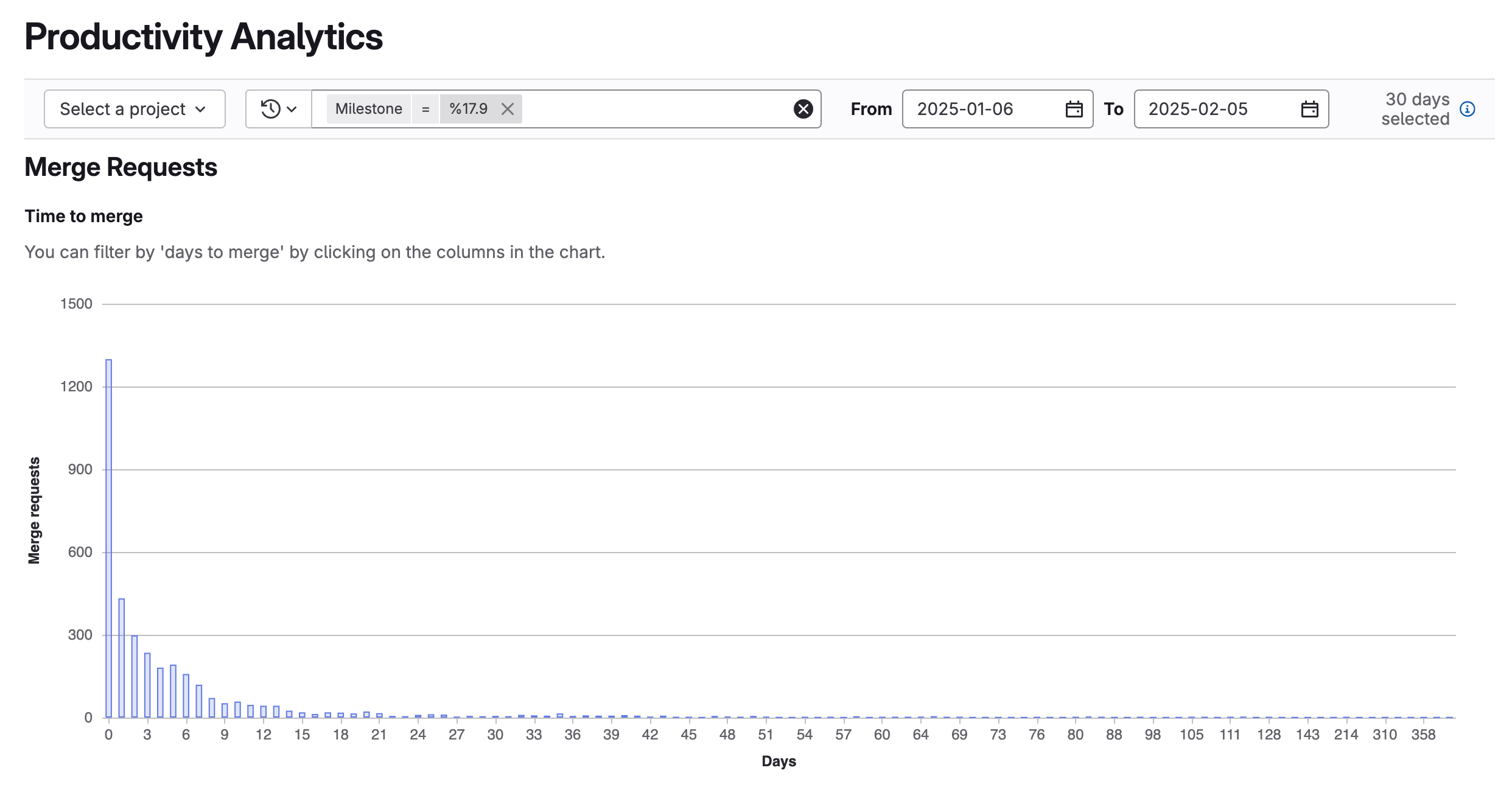
Productivity analytics display information about merge requests for groups.
Use productivity analytics to identify:
- Your development velocity based on how long it takes for a merge request to merge.
- Potential causes of merge requests that take a long time to merge.
- Authors, labels, or milestones that take the longest time to merge or contain most changes.
To view merge request data for projects, use merge request analytics.
Charts
Productivity analytics display the following charts:
- Bar charts that illustrate the:
- Number of merge requests by number of days to merge.
- Time between commits, comments, and merge dates.
- Number of commits, lines of code, and files changed.
- A scatterplot that illustrates the number of merge request metrics (such as number of commits per merge request) per day (merged date).
- A table that lists merge request titles, time to merge, and duration between commits, comments, and merge dates.
View productivity analytics
Prerequisites:
- You must have at least the Reporter role for the group.
- On the left sidebar, select Search or go to and find your group.
- Select Analyze > Productivity analytics.
- Optional. Filter results:
- To view analytics for a specific project, from the Projects dropdown list, select a project.
- To filter results by author, milestone, or label, select Filter results and enter a value.
- To adjust the date range:
- In the From field, select a start date.
- In the To field, select an end date.
